JIMMY WU
An aspiring UI/UX designer from UCSD who focuses on creating functional designs that values user satisfaction and user experience.
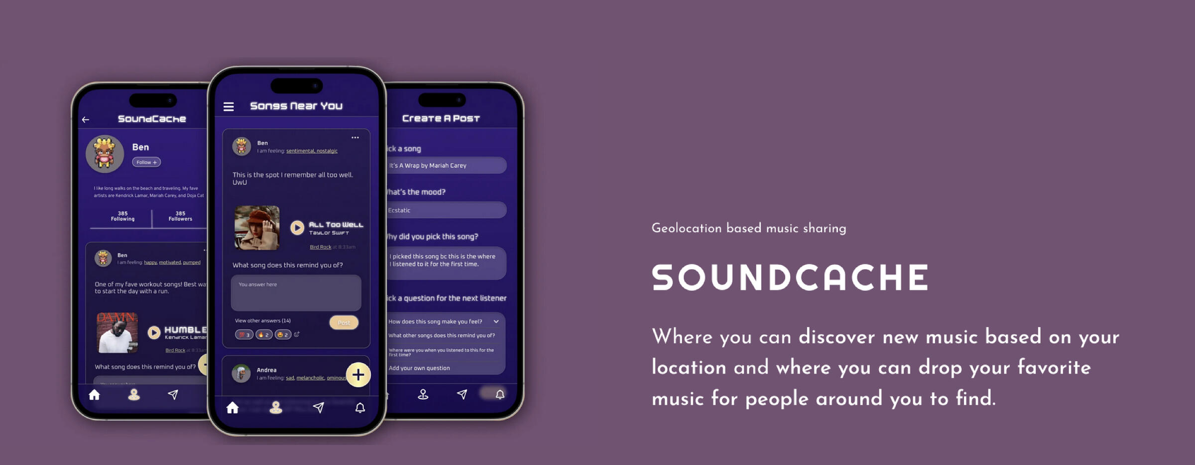
Geocaching is an outdoor activity of hunting and finding hidden objects through GPS. Our idea is a music app where you can geocache but instead of physical items, it’s songs! People will be able to drop a song at popular landmarks, or local destinations for other music lovers to find.

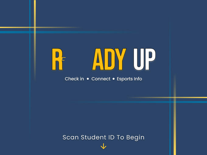
To create an engaging experience for new and experienced members of the Triton Esports Center that informs users of center events as well as streamlines computer check-in and reservation!

Background & Pitch
The goal of the gaming cafe kiosk is to create an engaging experience for new and experienced members of the Triton Esports Center that informs users of center events as well as streamlines computer check-in and reservation! The ReadyUp Kiosk serves to improve the process of reserving a computer when playing with friends or by yourself at a gaming cafe center with features like party finder, social gathering for gamers and Esports events that are hosted.
Problem
Sometimes when you planned a hangout with your friends at a gaming cafe, you don't know if the cafe is busy until they arrive at the location which can be underwhelming during busy hours once they find out that they have to wait for very long to use a computer.Checking in could be more formal which everyone has to do so staff can be aware of it which helps with organizing the space
Some hours will require a waitlist because of high occupancy.When TEC is busy, the organization of the PCs during open rec hours is a concern because people don’t know and there’s no record of who/what/when/how someone might use the PC.
User Testing 1
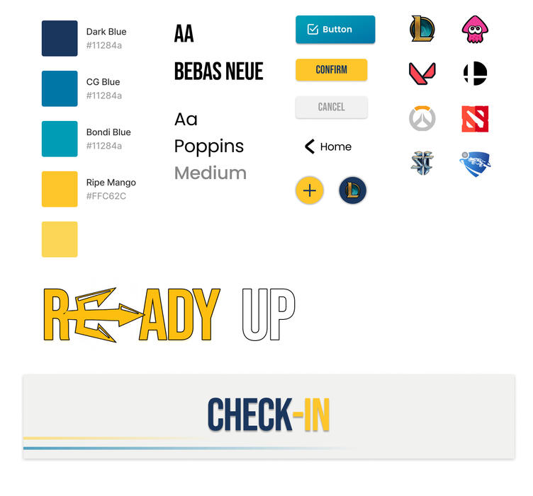
Style Guide
User Insights
The users were confused as to where the help tab for checking-in is. When users tried to reserve a seat they didn’t know that the feature is in the check-in page and they were not aware that the green buttons are how users can check in a computer.
User Testing #2
The users utilized the help tab for checking-in and reserve whenever unsure. The interaction was smooth from task to task. They liked the layout of the Esports Info screen.
Feedback
The help tab should be on the main screen, not on the check-in screen.Make things clickable as much as possible (such as the help button) for fat fingering.“Upcoming Events” section on Esports Info screen can be general community guidelines or FAQHave the kiosk save the user’s profile when they scan their ID which will save the last game they selected so that they can just click check-in which only requires 2 clicks instead of 5 if doing the entire process from the beginning.Thought the check-in was a bit overwhelming as he thought the game icons on the occupied seats represent the selection of games.Make game icons on occupied seats smaller or just have a small X as indication.
User Testing 3
Users were confused about checking in with reserving a seat. They did not know that the blue icons on the check-in screen are occupied seats. A compliment users liked about the esports info screen was the visual display of the Esports info events.
User Insights
Check-in and reserving should be in one step rather than multiple steps.Figure out how the party finder system would prioritize seating (ex. a seat opens up, hold the seat for the party of 4 that has been waiting for awhile or letting a party of 1 go in instead
Hi-fi Screen Design
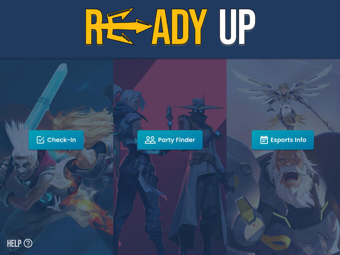
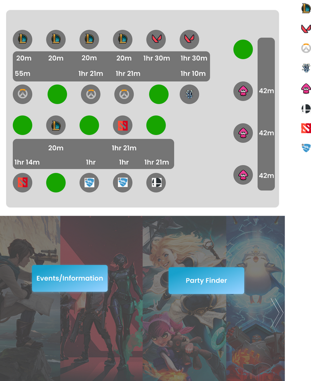
The screen design offers a simplistic UI for users to fulfill their 3 main goals of coming to the Triton Esports Center, which are for registering a computer, finding a party, and looking up Esports events. With the 3 options enlarged, the user flow will be faster.
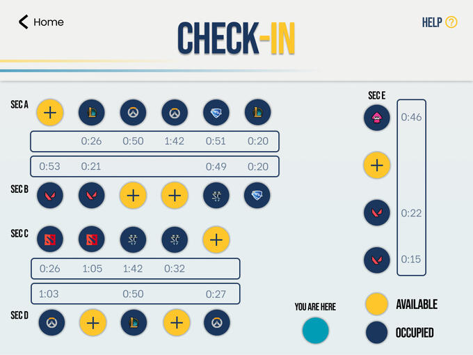
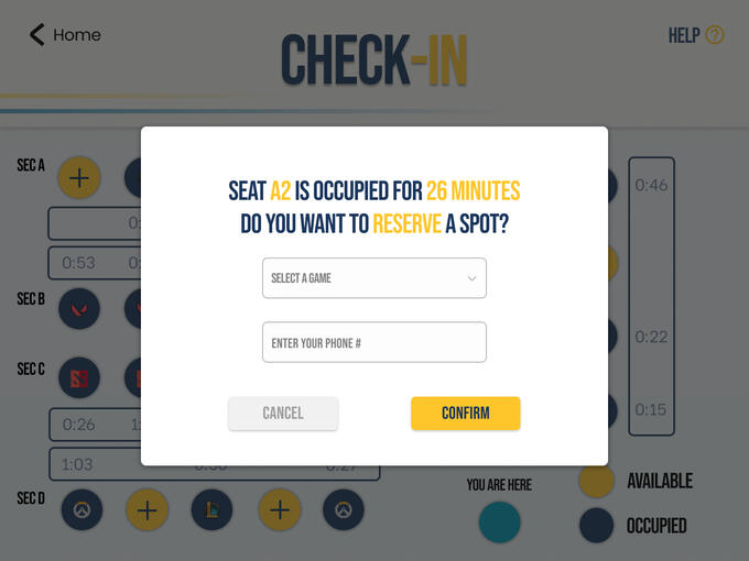
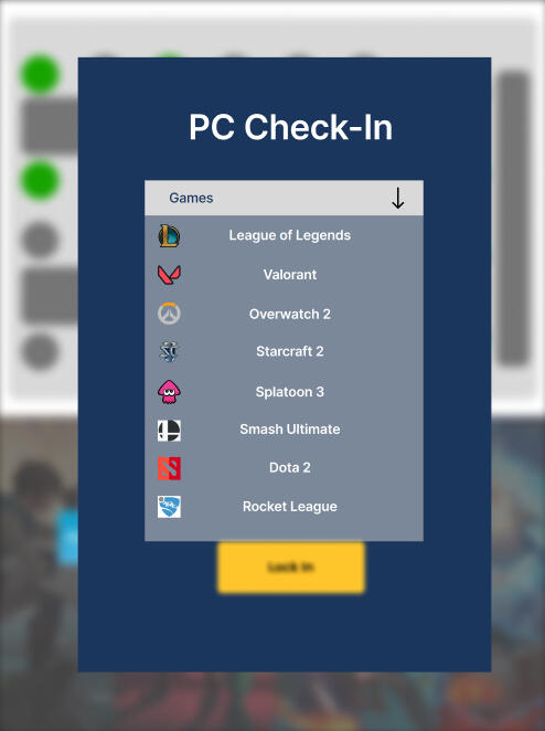
The check in screen is designed to mimic the real life layout of the TEC space so people can see which computers are unavailable and available that reflects on the screen. The timer also shows on the screen so incoming users of the computers can plan ahead of time if whether or not they will wait for the computers to play or just register to a currently open spot. The user experience of registering only asks the user which games they will play and their phone number for contacting them 5 minutes before a computer is available.
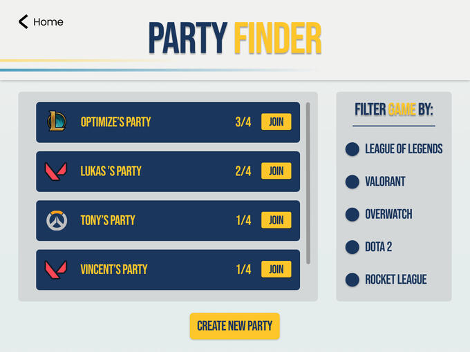
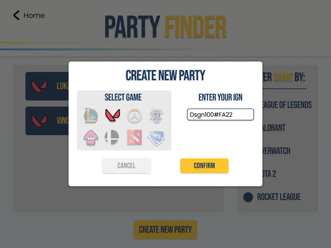
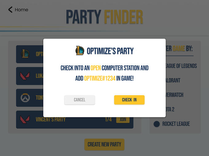
Users are able to meet new people or create a party to play games with their friends during their stay at TEC. People can join each other's party to play any games that are available at TEC and all they have to do is create a party of join a current party. The layout of the parties have nice spacing with 4 pieces of information that the user can see with a scroll wheel to look through additional parties. There is a filtering function in case when there are too many parties, then filtering by game can save user's time on finding their friends party that they would like to join.
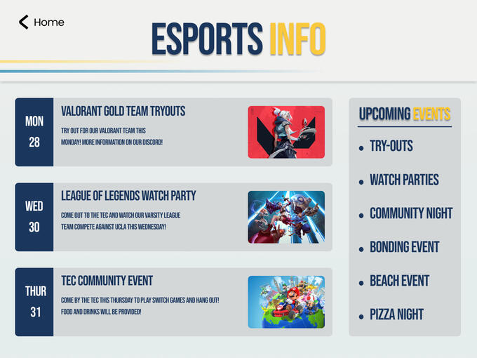
While users can use the TEC space to play games or do their daily session of ranked game, people who are interested in the Esports program at UCSD can also see events, Esports meetings, and tryouts for teams at the Esports information page. On the right space of the screen allows for filtering of which event to expand on a look for more info. The user interface of the event rectangles are in a decent size where it's not too big or not too small. An improvement I would make to the user design of this page is to make the events have more detail in them if the user clicks on the inputs.